Tuesday, 10 January 2012

Final Package Design


The final package design shown as a wrap around for display purpose. This design with the more coloured elements was chosen based on brief user testing of what they would prefer to see in a gift pack style as the context of this packaging being sold as. The reasons for this choice were that colour catches the eye and this also gives it a more finished feel that the black images that seem like a test.

Friday, 6 January 2012

Final Design choices

After some feedback and considerations to the design brief and also the clients needs I have chosen this selection.I have chosen the widow style to frame the labels shapes and gone with the Wye Valley Brewery's logo colour to keep it glean and not too in your face as with if white or black was the main colour. I have also added content to the back which includes food matching suggestions with beers in the pack and all the products that could be obtained in these packs.

I am now deciding on which of these two to go with as the final work.


Monday, 2 January 2012

New Net designs


Here I have added some extra tabs to my previous design to the bottom. The way these tabs work are that they are easy to slide in to the slits (not visible on here)on the sides on the back part, and and the gap on the tabs allows them to catch in the slots to hold in place so they don't come undone.

I have also placed the graphics on the package in a way that surround the beers to high light them.

Even though my original thought was to keep the colour of the box natural, I have further experimented with other colours as well as window variations to see which is most appealing.


On printing they would not have the black lines, they are there to show the net layout and folds easily.

Thursday, 22 December 2011

Graphics

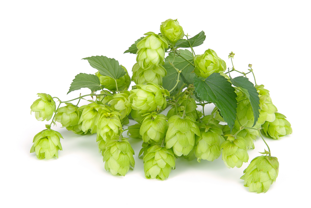
I looked for some images to base a firmer more real design of the elements of barley an hops that i would like to use as illustrations the packaging.

As I want to create the final net and layout in Illustrator I'm going to use these to create a representation of hops and barley in one colour tones to keep them simple.


Monday, 19 December 2011

Peer Assessment

For this peer assessment I presented my current prototype package to date, and the feedback that I received:

Positive
The eye catching handle design
Flat packable
Easy to put together
Box material is strong

Development
Work on locking tabs to secure strength of box
Maybe add a method of closing to the top of the package to hold the handles together
Develop the graphics of hops and barley on the package and these could be cut outs


My thoughts on this feedback:
Yes with my current prototype I have seen that the sides can move but thought this was do with to the bends already in the cardboard. I could add some tab locks to the bottom of the package to lock with sides to keep them secure.

This was the problem I had with my last design of getting the top to close and not open when carried by the handles. I could use twine to add a sort of shoelace knot to seal the top. Another type of lock I could use is a weave lock so it has 2 tucks instead of just one to make it more stable hopefully, the positioning and implementation of this would need to be thought through.

The graphics at this point were in watercolour pencils straight on the box. The end intention of these graphics are to be printed in a subtle colour of the object but will be visible. The idea of having the hops and barley images as cut outs is a very nice idea and I think of a few of ways to do this idea.

The first being cutting out the little pieces of the image so we leave a mesh image to see through. It may be a tedious task to push out all the little piece when  constructing the package unless they are already out at the printing/cutting stage.

The second being have the images raised by having another layer of cut out parts stuck over the images, which would add a layer of interest to the box and a tactile element. The problem with this it would introduce glue which we don't want.

The third idea is to emboss the images so they are raised out of the package for a tactile feel and an appealing look. This idea may be for doable and also wouldn't sacrifice the integrity of the packages structure strength with holes.

Sunday, 11 December 2011

Redesigns

I went back to the first prototype that I presented and worked from the questions after the CAT visit, to cut down my material usage. The one main issue that I had with my design was the handles and how they would fit together to secure the package and one currently pulled out the other, so this was not a very stable design.


As it shows here in my net, I have reduced the cardboard used for the sides by cutting out the overlap that will not be of any use in the package. I have also improved the handles by giving them a larger base. Here I have left the top open but this could be joined/sealed together with some string/twine. 


The graphics ideas that I want to display for this product are the purity of the ales by showing the two main ingredients that have an easily recognised image, and the idea of local business, in supplies and where sold. Here with the logos I was experimenting with placement and testing sizing to portray the partnership of the local businesses. After seeing this placement and the size comparison, I may shrink down the Legges logo and fit it above the condiment window, to show the relation.

My issues with this design now are the figure out how to make a second use out of this. As my first idea was a dart board with the original design but this would be a one use thing.

My other thoughts want to bring in the pairing beer with food idea and a condiment holder would go well with the condiment supplied in the this pack. I have tried to design a condiment holder out of this package design, and that turned into a tray but realised their was an obvious flaw with the windows in the packaging and small condiments could fall through when it is flat.

My last thought  at this time was the simply use the package as it is, and use it for storing odd cut out recipes, and pairing suggestions of condiments and drink.

Design considerations

To improve my designs I wanted to look at better tabs to hold my designs together securely.


The tabs on this package are 3 cm in hight to 3.5 in width and hold the package together very securely around the items giving a snug fit. The size of these tabs are big enough to not be damaged easily by just unpacking the items, and the kind of hook image of the tab makes it so that it should slip through the slot.
I think these could be a good template to improve my tabs and build a better and stronger supporting interlocking system. 

Saturday, 10 December 2011

More Designs

I have been working on developing more designs to work with second uses. The second use I had for my first prototype was a dart board but this could only be used once as holds would develop. the ideas i have been playing with are to involve the incorporation on food and beer. Having a condiment in the pack leads me to producing a condiment holder/carrier.


To explain my design it is a 6 sided prism shape that will hold two bottles at the back and the condiment at the front.
The second used would be to turn it in to a condiment holder by cutting along midway at he front and then once two side back panels and punched out mats are separated it will fold over at the backto become the handle and two halves as the trays.

I have then made this into a prototype:

This was a scaled down version and found that the tabs were put in the wrong place and could make the base drop with the weight of the bottles. This would be a nice second used but needs some reworking for strength of the basses.

Thursday, 8 December 2011

Further Reference material for alternative packaging and

While looking for more packing design examples for drink gift boxes, I have found some that have been driven by the need/want to replace the material used to package the bottle as it maybe bulky for need of protecting the product but is not friendly.

A new cardboard wine shipper from sustainable UK packaging company Knopak. This is a sturdy cardboard package for wine bottles that keeps it secure and protected by the firm supports.
It can be stored flat, assembled easily uses not tape or glue and is not bulky.
http://www.jancisrobinson.com/articles/a20090514.html

This just shows how useful cardboard is and how many people are basing their ideas off of this material that is easily recyclable.

Friday, 25 November 2011

Visit to Wales Centre of Alternative Technology

At CAT there was some interesting work and ideas of alternative building design that I found quite appealing, and effective for its purpose of reducing it carbon foot print on the energy needed to produce the materials used and the result of how efficiently they work.
These are good ideas themselves and maybe effective in the long run, but as said in one of the talks, even if we became efficient enough to reduce our carbon emissions to even 0 it would take about 50 years for it to take effect on the globe.
This would be very difficult to achieve with our kind of infrastructure and economy based on consumerism, it would then cripple most businesses. 

Friday, 18 November 2011

Recycling reason

This was on the back of the cereal box I used to make my prototype.

Less packaging waste ideas

These show some cleverly thought out second uses for the packaging of a product.


http://dornob.com/shipping-eco-friendly-products-in-multifunctional-packages/?ref=search
The idea here is the shirt is sent in this package and with buying more clothes you will need/want more hangers and the packaging that the shirt came in conveniently can be constructed from the direction on the packaging into a hanger.
This shows that the idea was considered about in mind of the item that was contained in the package.


The lite2go utilises the main body of the packaging as part of the product with a small recyclable strip of cardboard left over. This shows real creative and feasibility of the product become part of the packaging for some items.
http://www.hippyshopper.com/2007/07/lite2go_by_knoe.html


This example is more about reduced to fit packaging and other tidy elements inside the packaging to hold information.


http://lovelypackage.com/incase/
A tidy and individualised to the company box that has a compartment for documentation that is supplied such as a receipt.  The over lapping lid held by the string/elastic seems strong.  It is also nice to see that the box fix the product in size so there is no excess amount of packaging needed to be filled with paper, bubble plastic etc to stop the item moving around. 

Monday, 14 November 2011

Further development, nets, and prototype

Here I have developed some more ideas on my first design of using slots, by evolving the shape more so, that could work into a second use of a decorative stand by its self. It kind of combines my third ideas second use of a condiment holder.


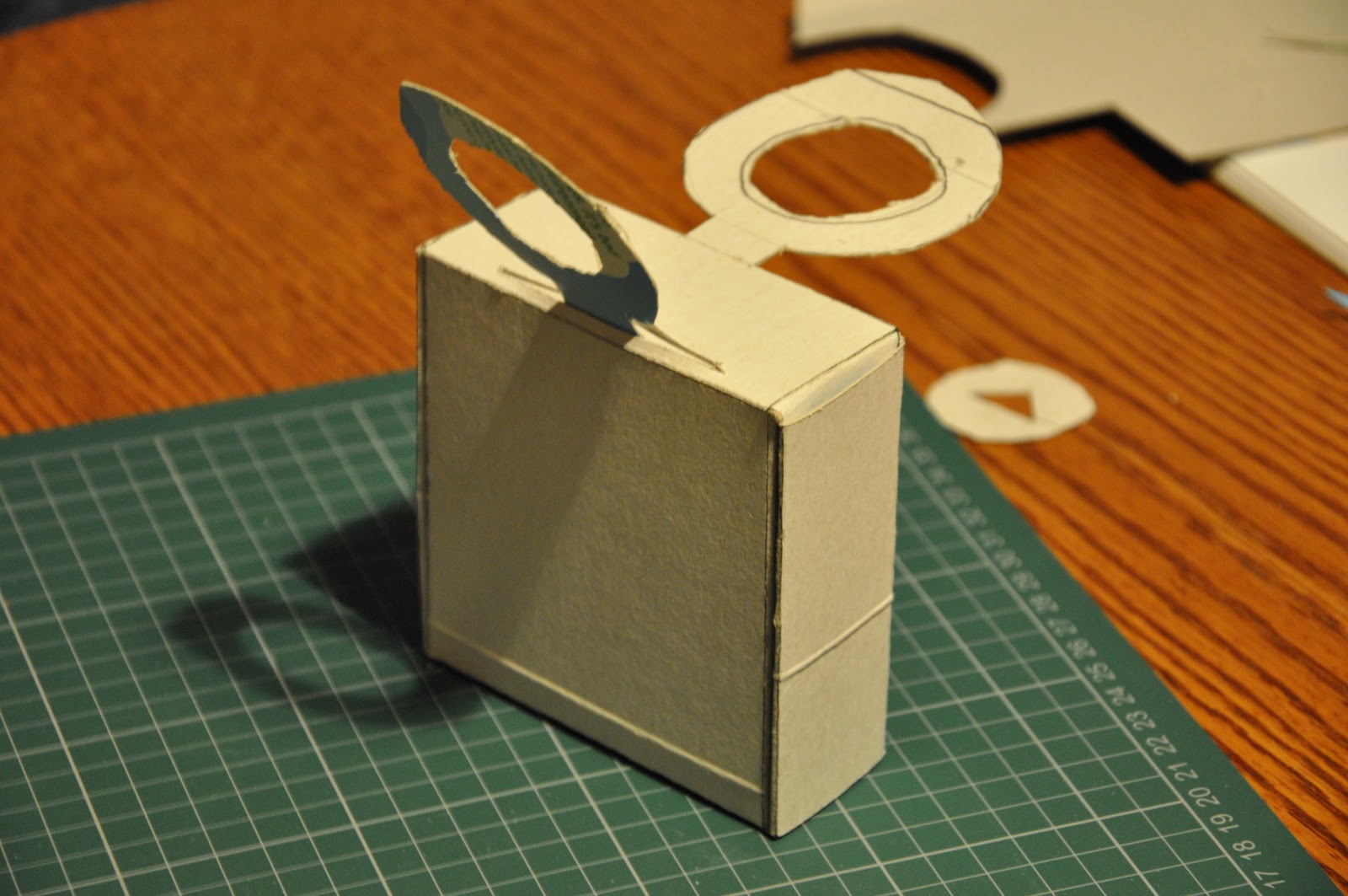
This is a net for my second design worked out with tabs and slots so no need for glue. I have also gone on to develop a scaled down prototype of my design from a cereal box.


On making the prototype for this design, I think I need to improve the top sections closing and handle system as these kept being pulled up when used.
I will work on further designs to improve this and later this week get the cardboard material I want to use for my design so I can make a full scale prototype and test it properly with the size and weight of the bottles.

Sunday, 13 November 2011

Deconstructing Packaging

After the tasks of working with nets,  I thought about dismantling other packaging boxes to have a look at their nets.
Most used glue in some form of little amount to attach the sides together, but I managing to find a couple of examples that were completely glue-less, and these are the ideas that I will take forward into my own design of the Wye Valley Brewery packaging.

The Wii Balance board box had glue to attach the sides together. But here I'm looking at the fold over that holds the plastic handle in place.


The bottom of the box has an overlapping interlock that hold quite firmly with weight in the box, which I find is a good design without using glue.


Looking at the draws that are inside the Wii console box which organises the parts into their own tidy compartments. The draw itself is made as a thick boarder. The compartments inside are made from a cleverly folded net that is held in place by the boarders of the draw.


This box is much like the wine carrier, which uses glue to hold parts of the overlapping base parts when the box is flattened.


A 3DS box, cleverly designed with no glue. Folds and small slots to hold sides in place. I will try to incorporate this element into the design of my box for stable holding. It gives a layer of strength to the sides of the box.